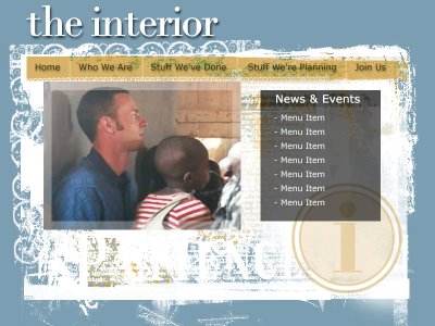
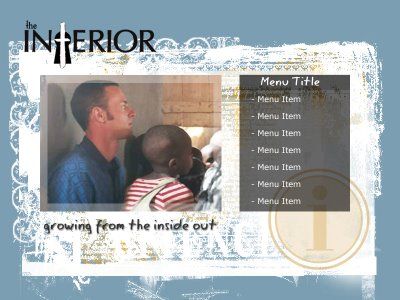
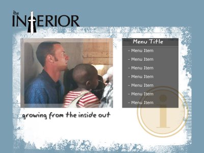
So, I'm planning an update to my church's website (http://www.theinterior.org) and have finished the first draft, still-in-beta mockups of a new look. What'cha think? When looking at these prototype sites, you can ignore the text of the menus. They are purely placeholders. Feedback I'd like is whether you prefer the text version of the title (in sample #1)or the image version samples #2 & 3. Also, in samples #2 & 3, notice the slight changes in the white background. Do you prefer one over the other?


Thursday, June 22, 2006
Dreaming up a new Interior Website
Subscribe to:
Post Comments (Atom)


No comments:
Post a Comment